Mechwar
2D Cinematic Intro
Concept, Copywriting
Style Frames, Storyboard, Composition
Motion, Edition, Sound Mix
Overview
The gaming streamer landscape is constantly growing, with new creators emerging every day. Many of these start their journeys with limited access to resources, such as promotional materials and professional equipment. Despite the difficulties, those who persist in the journey of streaming their games may face another challenge: creating a visual identity that is true to their channel and audience.
Recognizing the difficulty they face in creating an identity, I decided to dedicate myself to this demand, as I believe it is a crucial element for audience loyalty and recognition with advertisers.
I developed a service for creating and producing audiovisual pieces for gaming streaming channels. My goal was to assist in all stages of the process, from defining the concept and style to producing intros, transitions, alerts, and other elements that contribute to the channel's visual cohesion.
The Problem
However, presenting the concept of visual identity is something quite technical and far from the reality of most streamers.
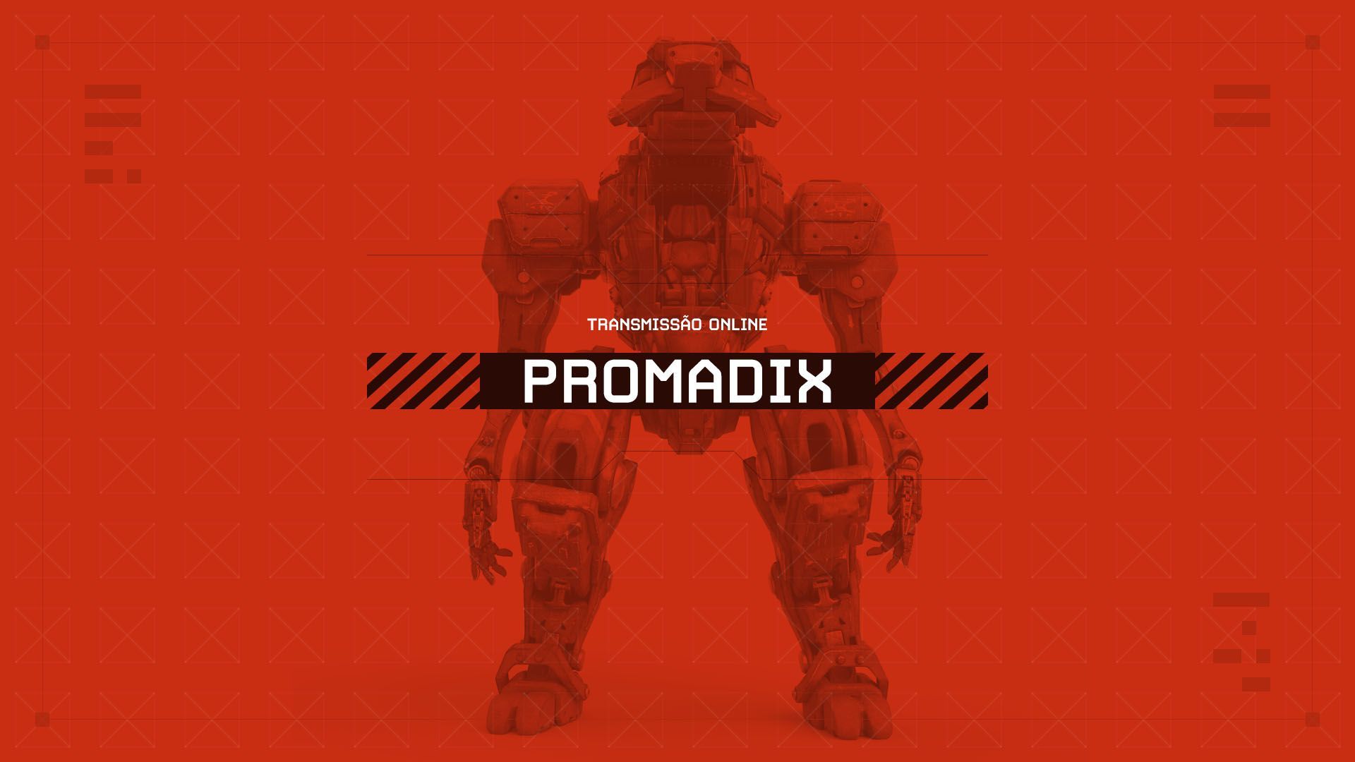
To address this, I created my own streaming channel and developed the MECHWAR visual identity, a complete template that
demonstrates in practice the potential of a well-developed visual identity.
MECHWAR is focused on games with large war robots, divided into resource management and combat. The intro summarizes
the gaming experience, while transitions and alerts reinforced scenes of what was happening in the game in real time.
To do this, I had to study everything about game streaming: websites, tools, mandatory visual arts, and technical limitations.
With all the necessary pieces in hand, I started my broadcasts and commercial presentations for clients, showing the work
process, what would be delivered, and its advantages.
With months dedicated to research and a lot of effort, this journey turned out to be a rewarding learning experience.
I was able to close deals with new clients in the first few months of presentation.
The Challenges
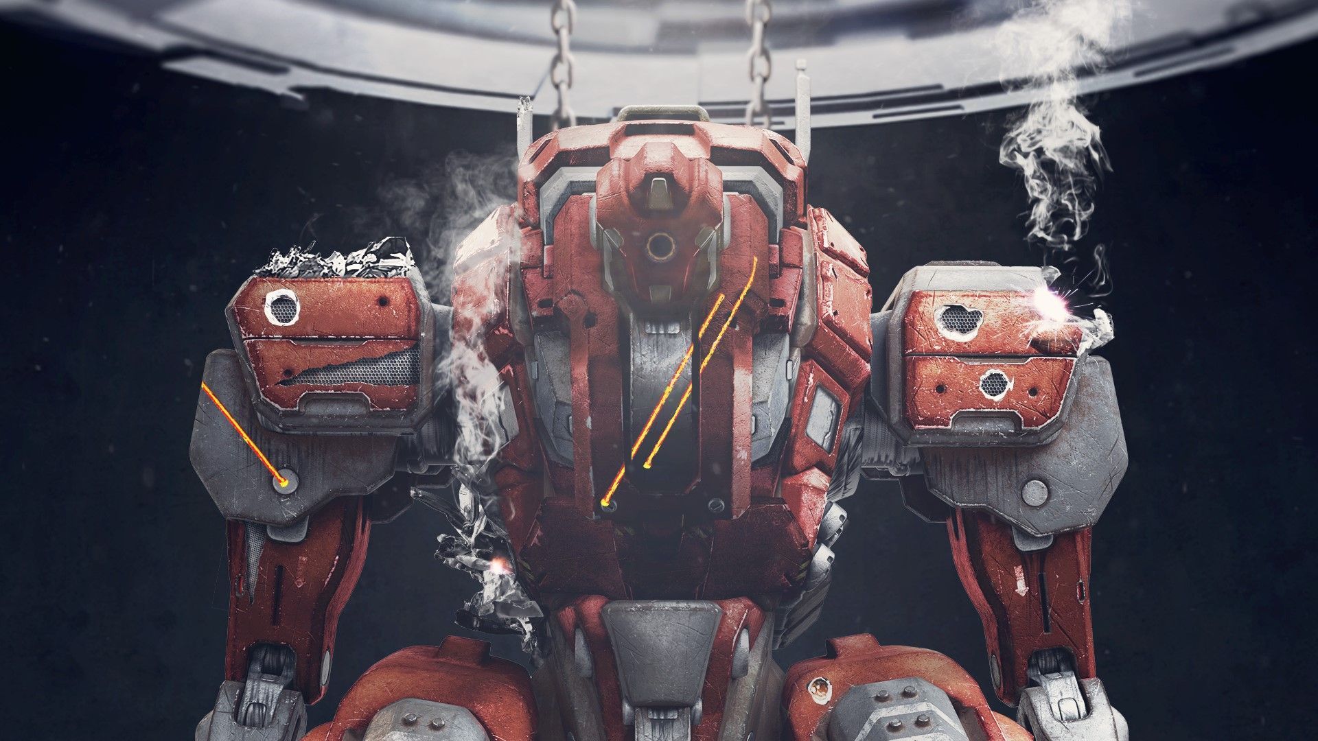
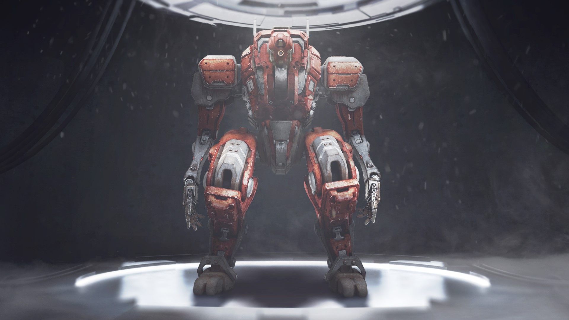
The primary goal of this project was to establish a realistic visual identity by showcasing a mech in action. This involved achieving a cohesive narrative and unified visual, all while utilizing the same robot as the central element.
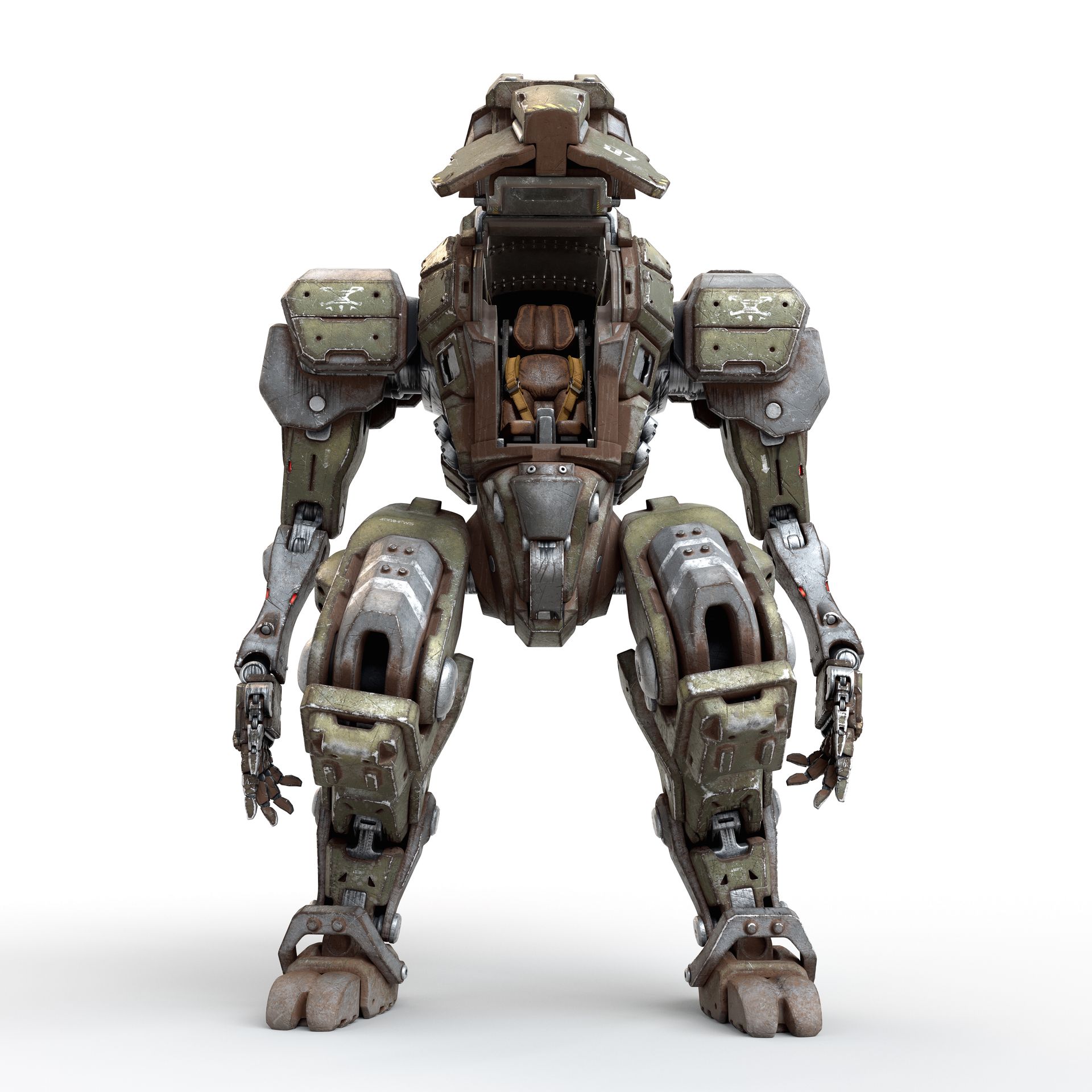
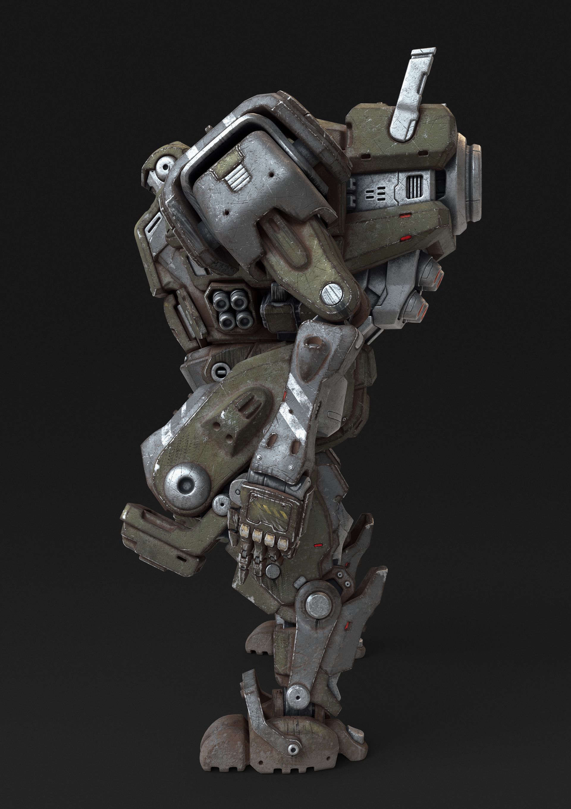
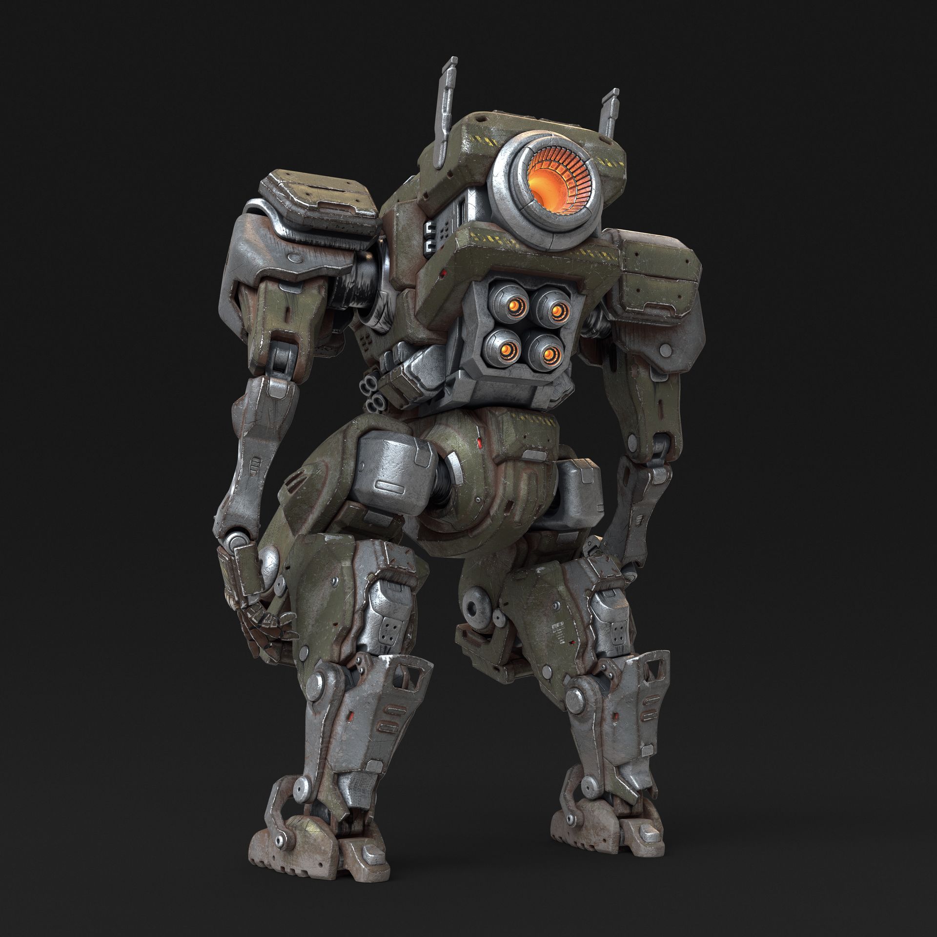
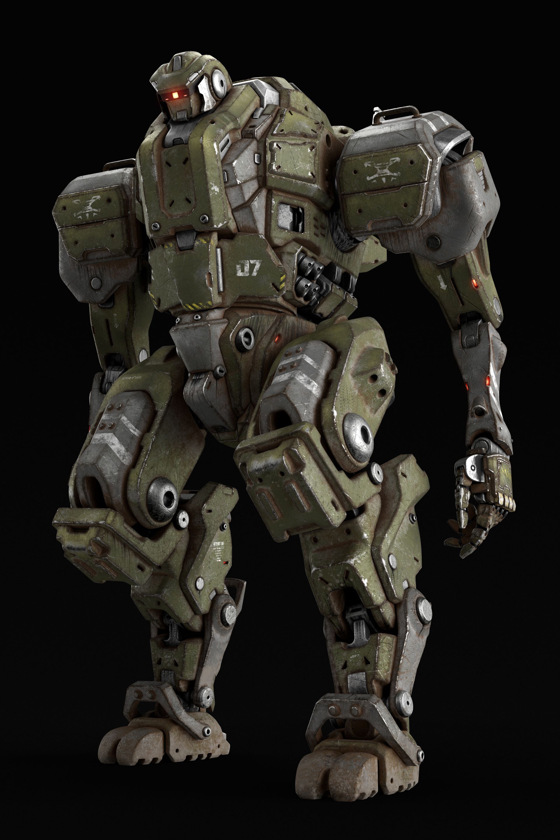
Due to limited 3D experience, alternative solutions were necessary to create the desired effect. The main challenge was finding rendered images of the same mech in different camera angles, all compatible with the project's vision. After an extensive search through stock image websites, i found an artist who had rendered multiple camera angles of a robot that perfectly aligned with the project's requirements.
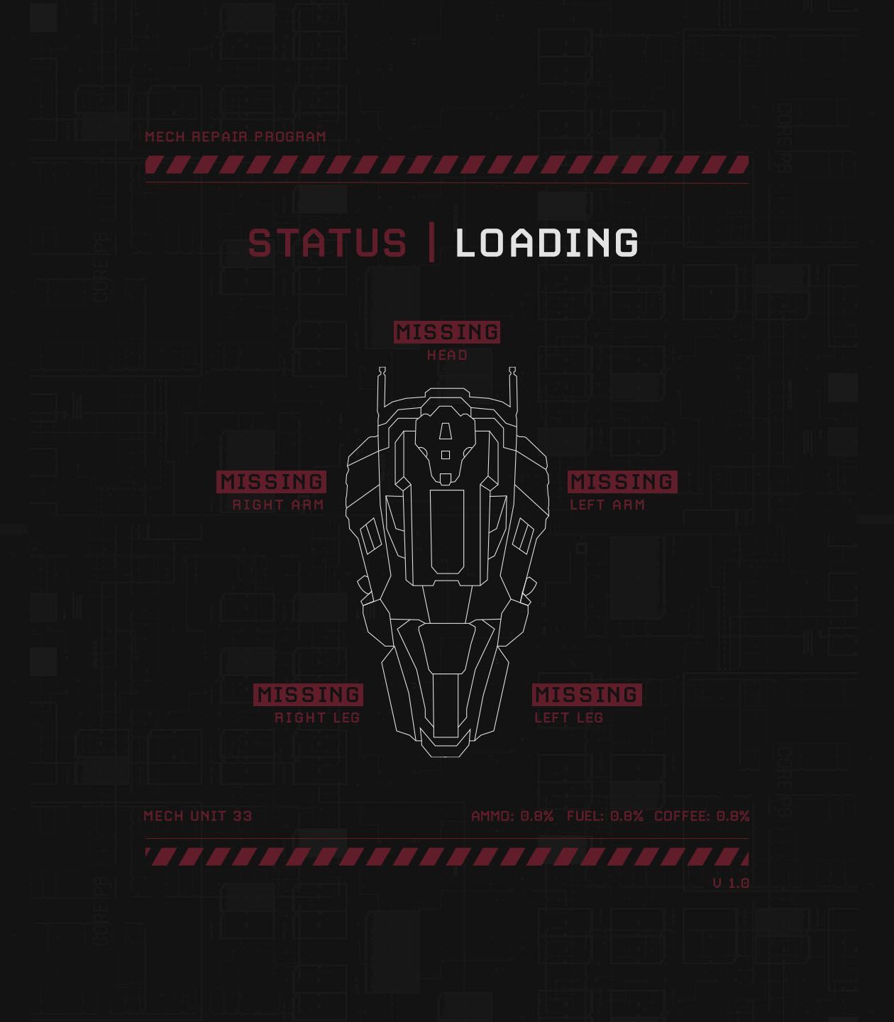
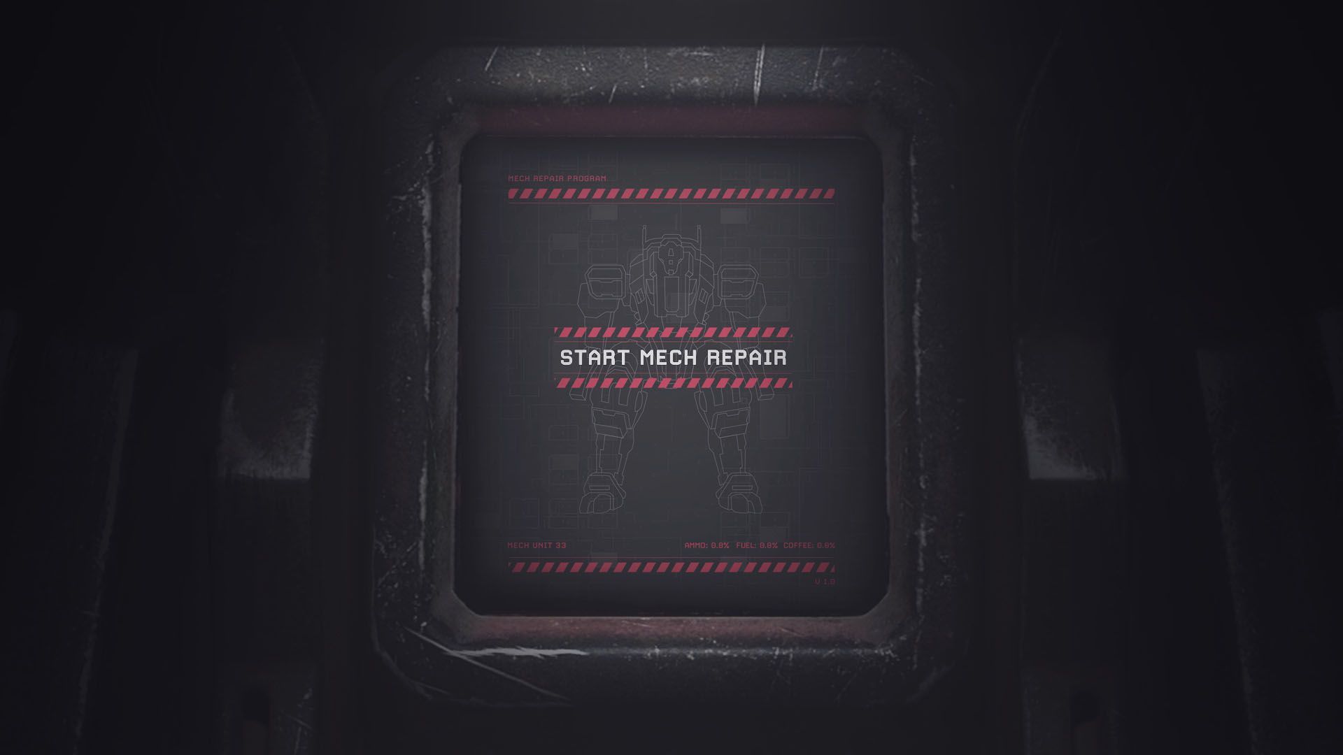
"I also had to create the entire UI, replicating the mech's design."
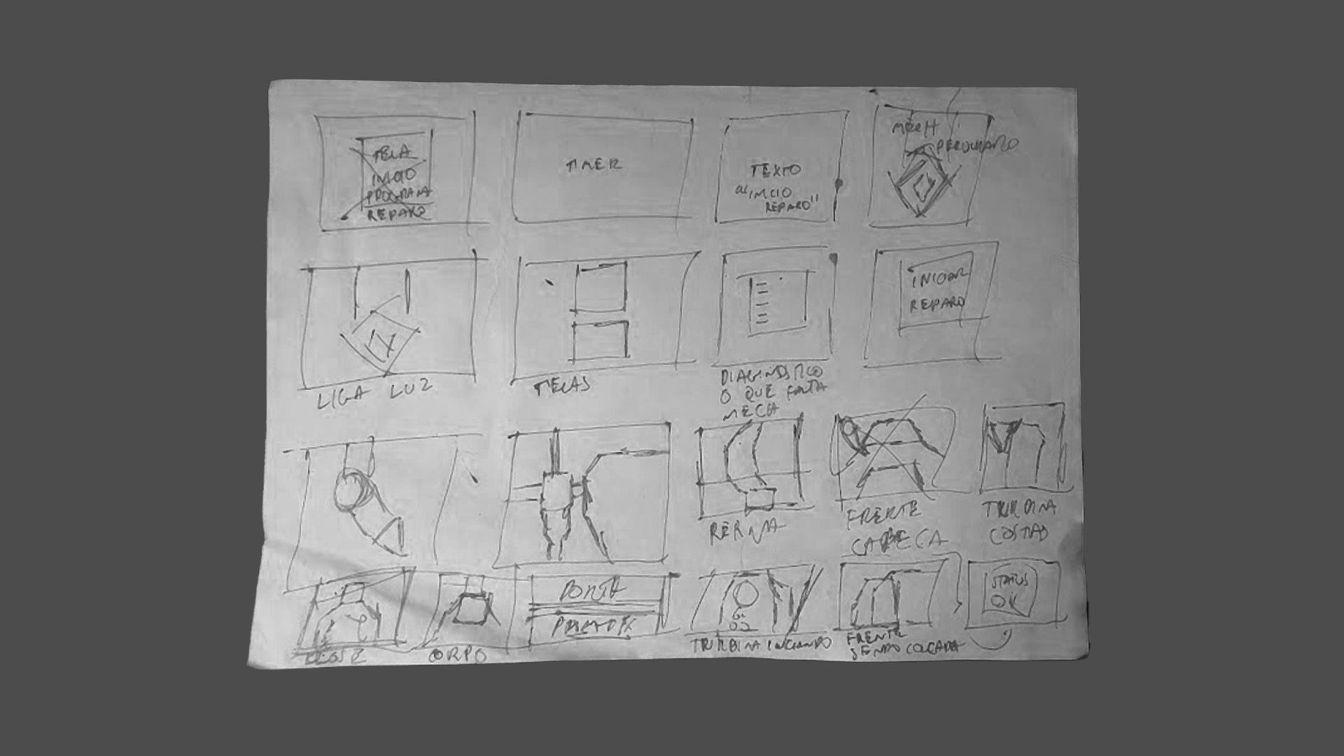
Animatic
Obstacles and solutions
Simulating these images as if they were realistic 3D was another challenge. In most scenes, there was an emergency light passing over the mech, which, in the initial tests, did not provide the necessary depth of a 3D object.
I searched for various solutions to this problem and, out of curiosity, had an idea while playing the game DOOM (2016), in a level with a similar emergency light. To address this, I duplicated the light and added a delay in the animation compared to the first light. This second light I applied only to areas distant from the camera. Thus, I was able to achieve a result close to what I wanted.
Some of the original images lacked sufficient lighting to showcase the details. The solution was to adjust them in Photoshop and recreate some of their parts.
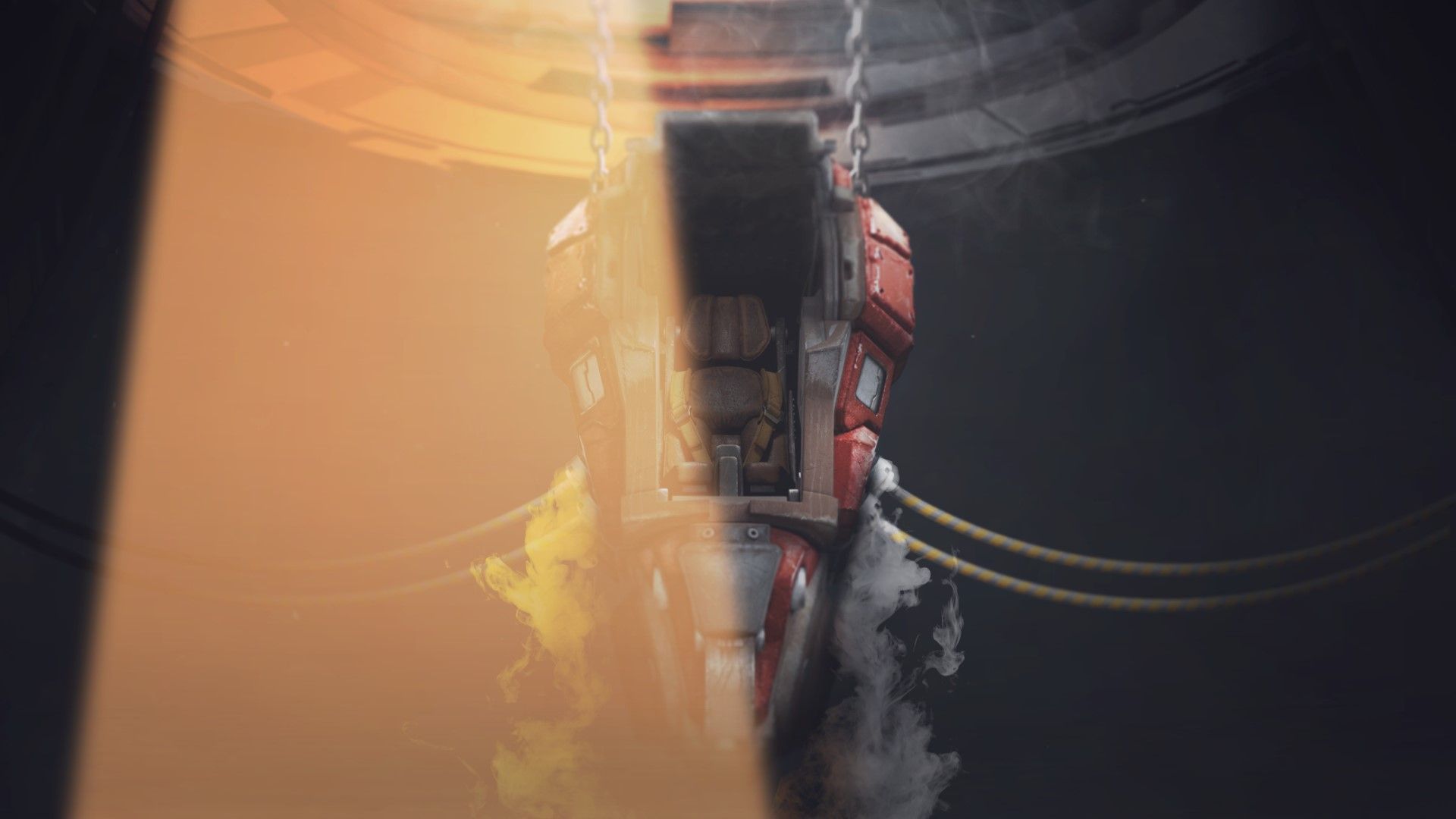
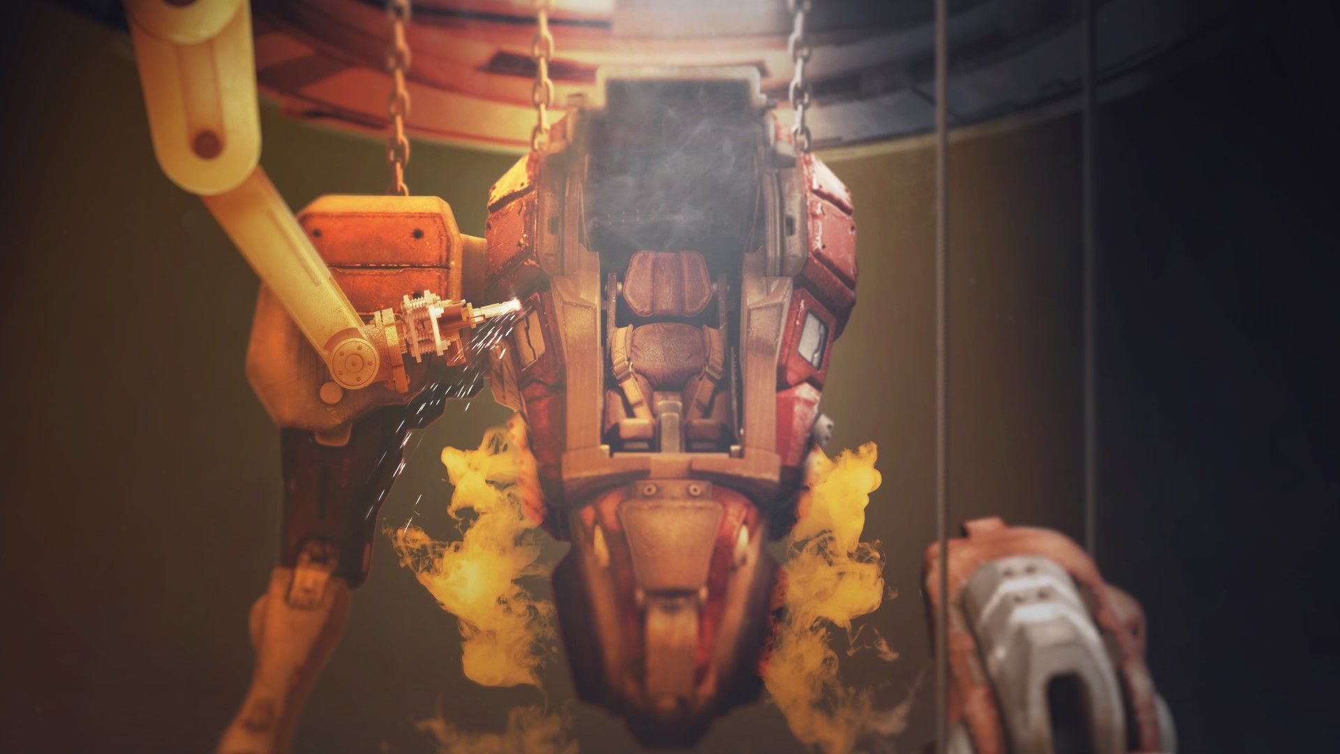
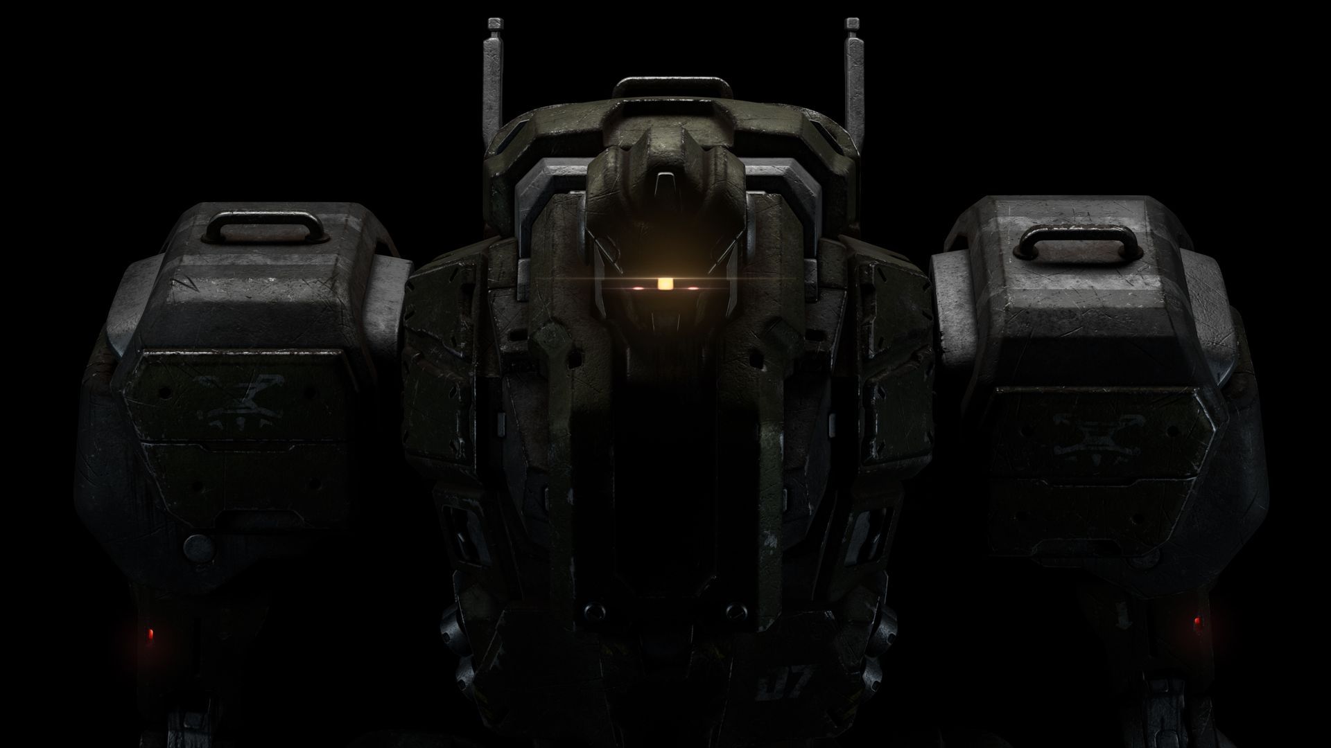
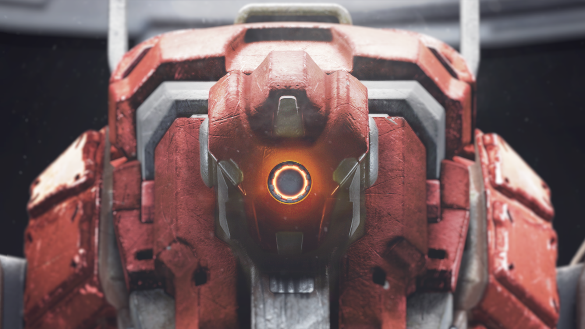
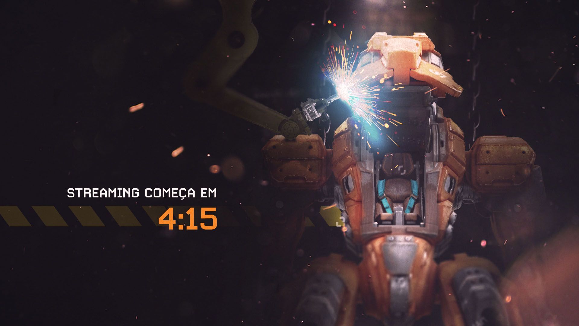
The intro was already a lot of work, but it was still necessary to develop the intermediate pieces (break scene, outro, transitions, alert boxes).
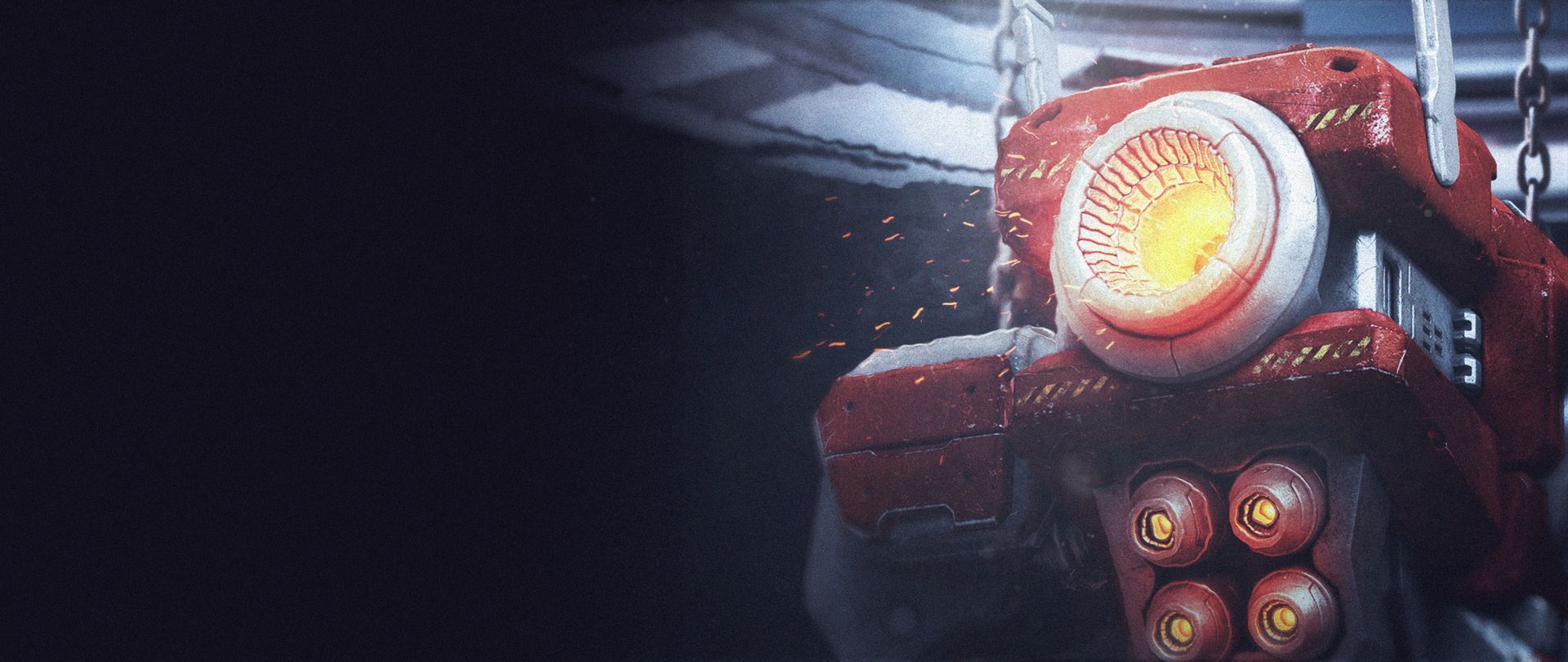
For each piece, the goal was to connect it to what was happening in the game. If it was a moment of battle, a transition showed the mech preparing itself. After the combat in the game, the mech returned for repairs.
